I told myself that I wasn’t going to do it. I had upgraded last year to a Series 3 (my first upgrade since the original Apple Watch) and there wasn’t that much different this year.
Still, at 2 A.M. on pre-order night, I ended up reserving an Apple Watch Series 4 for in-store purchase.
I claimed that I was doing it for the website, and truthfully, I am, but after a few days with the Apple Watch Series 4 on my wrist, I don’t regret anything.
Design
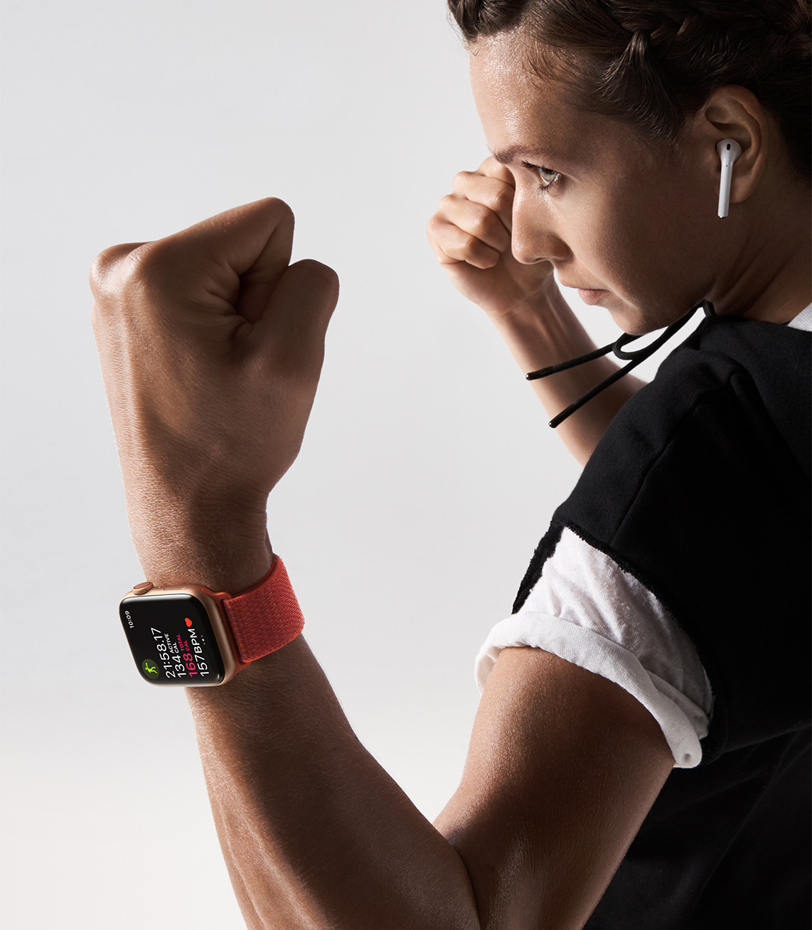
The first thing people will notice about the Apple Watch Series 4 is the new design. While the watch is just barely taller (the height of the screen) you can’t really tell that much is different from previous versions. It’s when the screen is on that all the differences come out.

Apple claims that the screen on the Apple Watch Series 4 is about 30% larger. That’s larger by volume, not diagonal btw. The screen is the thing that really makes this watch feel different. There is so much more room on the screen, and Apple-designed the software to feel bigger as well. Text is a bit bigger, touch targets are bigger, everything is bigger, except the body of the watch.
The screen is amazing. Honestly, it just seems so vivid and colorful, and big.
But the screen is not the only thing that’s been redesigned. The entire thing has been stripped down and built back up. The Digital Crown, the rotating dial on the side of the watch has been rethought as well. The normal user wouldn’t really notice anything especially if the watch is off.
In use, the Crown feels so much smoother. The designers at Apple also thought to add Haptic Feedback to the crown, so now as you scroll through a list or even just your feed on the Siri watch face, you can feel it click. It makes the watch feel more immersive. It’s one of those nice touches that aren’t really needed, but once you have them you can’t imagine going back. In fact, when I scroll through an app that hasn’t been updated yet, I noticed.
As mentioned early, the body of the Apple Watch Series 4 has been redesigned as well as the screen. The watch is now smaller per volume than the Series 3. It’s hard to explain how different this watch feels when worn compared to the Apple Watch Series 3. It just seems to sit better on the wrist, and it feels so much lighter than before.
The back of the watch has also been retooled. The heartbeat sensor on the bottom have been remodeled and seem to work much better than ever before. The bottom of the watch has also been made out of a ceramic material now to help send radio waves out. I especially like the dark tint of the bottom compared to the previous models which were made out of whatever case material you had plus a giant black bulge.
I think that it could be hard to pick out a new model if the screen was off (unless you got the gold stainless-steel model). Every change seems to be a step in the right direction.
Software
Looks are all well and good but if you can’t operate the thing, all that stuff goes out the window. Apple has now had 5 versions of watchOS now, and this year definitely seems to be a great refinement of what the watch already does well. On the Apple Watch Series 4, thanks to the updated processor and probably the move to a 64-bit processor (making it capable of more powerful operation) the watch seems to fly.
Apps open quickly. I haven’t had to wait on the spinning dial yet. Very rarely do I open an app that’s not in my dock or complications, but when I do, it still doesn’t take much for the watch to open it. My Series 4 will open things about twice as fast as my Series 3.
My only complaint on the software so far on watchOS 5 and with the Apple Watch Series 4 is Siri. I’m not a Siri hater, in fact, I use her fairly often. I just hate how long it can take on the watch sometimes. It’s not all the time, and it doesn’t seem to matter if the watch is near or if you’re on LTE. Siri just doesn’t feel as responsive as it should.

I will say that two changes to Siri on Apple Watch Series 4 are interesting.
For the first time since watchOS 1, the Siri waveform (the squiggly lines at the bottom of the screen that represents Siri) finally dances to your voice again. The original watch had lines that moved with your voice, but the first major upgrade killed that feature as Siri gained more colors and changed in appearance. Finally, though, the lines move again.
The other thing is a watchOS 5 feature, raise to speak. Now you don’t have to say the magic “Hey Siri” phrase to activate the personal assistant. Now, you can just raise your wrist up to your mouth and say “turn on my lights” and Siri is supposed to respond. So far, on my Series 3 and 4, this feature works about 60% of the time. I think I’m not trained to use it just yet, but I think I’ll get it. I also think this will help cut down on all the devices that ping when you say the magic phrase.
Finally, I really love the changes that Apple made to the OS in regards to the Series 4. Nothing is majorly different, Apple just added rounded corners to pretty much everything. This is reflective of the screen on the new watch, and Apple could have just left it to the full-screen app, but instead, all the boxes and the app previews in your dock now have rounded corners too.
I’m not sure why, but it just makes the entire design feel more pleasant. It’s more inviting and heart-warming.
Workouts
I haven’t gotten too far into the workouts app just yet honestly. So far with my Series 4, when it comes to actually using the workouts app I have only done 2. Gone on a walk and played some tennis.

I can’t recall a time when I have ever gone on a walk and closed my Exercise circle until this weekend. I could have been the heat, but upon finishing my 2-mile walk, I had closed my circle. I’m chalking it up to a more refined heart rate sensor in the Apple Watch Series 4, because when I ran my tennis workout, the metrics were on track with what I got on previous watches and trackers.
Health
The headlining feature of this watch, the ECG hasn’t been enabled just yet. It will come in a later update. I’ll try to remember to update this part when it launches and I’ve had time to spend on it.
As far as fall detection, I haven’t tried it out. I’m pretty physically active and I don’t think I’m going to turn this feature on just now. If I were older, or worried about falling, I might turn it on, if just for the moment.
There’s also the low heart rate sensor that will notify you if your heartbeat drops below a certain range as well as if your heart starts beating too fast.
All these features are designed to help save lives. It’s crazy how much a little watch can do.
Connections
I only purchased the GPS model this year, since I hardly ever used my Series 3 on LTE last year. So far, the connection seems pretty strong to the watch. I feel like I have signal even though I might have wandered farther off from my phone.
I can see the allure of having the always-on connection, but really I just never used it. Maybe if the cost of entry and the monthly fee were lower this would be more appetizing. As it is, I feel like the Bluetooth and wifi will be enough for most people.
Need help choosing if you should get an Apple Watch with LTE or not? I wrote this little guide to help.
Watch Faces
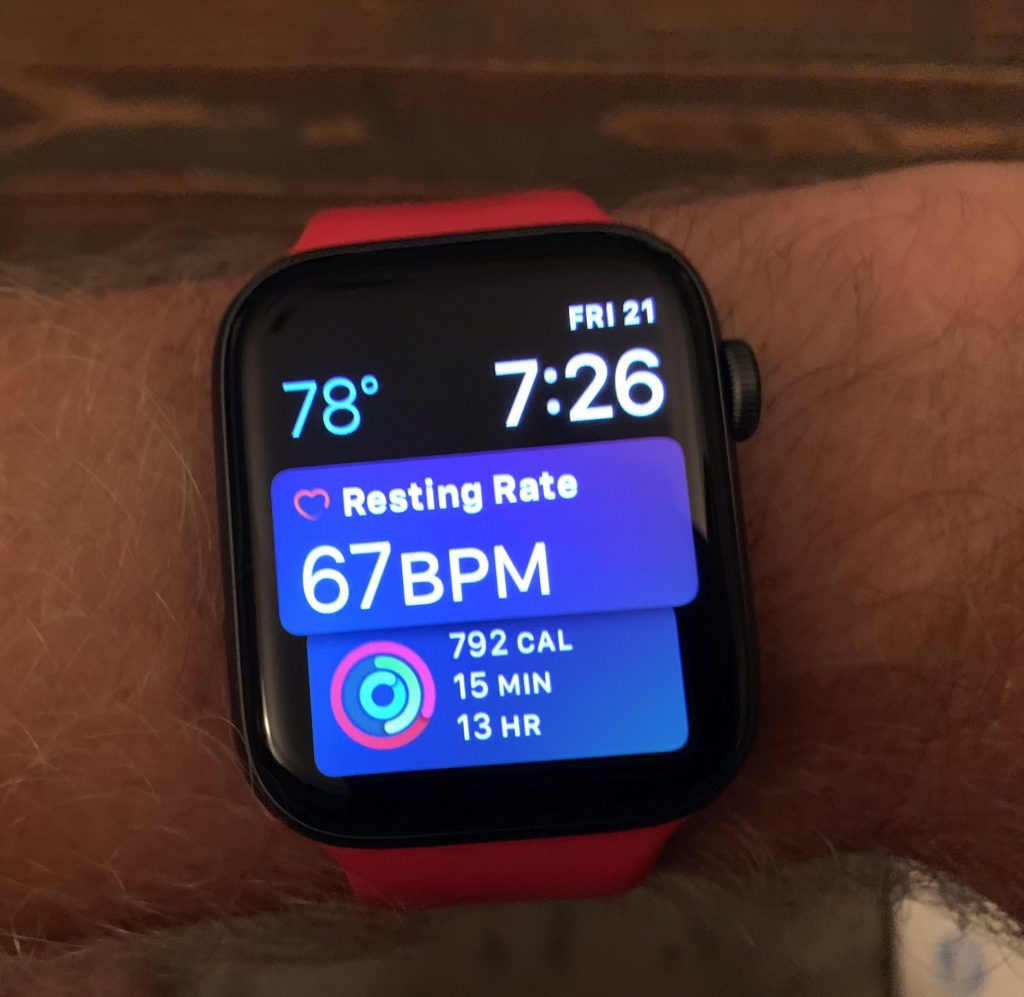
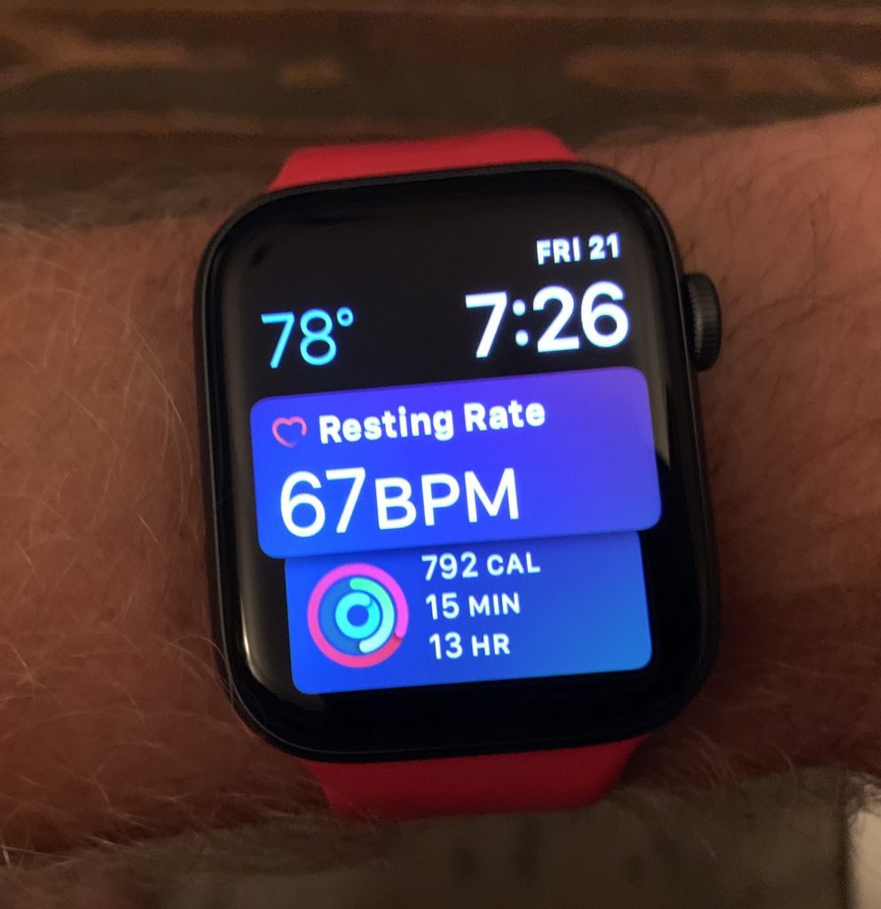
Apple has added a few new watch faces in watchOS 5, but a couple are exclusive to Apple Watch Series 4, Infograph, and Infograph Modular. In all the Apple media it is promoting the Infograph watch face.
I think the watch face looks great and supplies the wearer with tons of information. There are some many places on the watch face to have information though, it’s almost daunting to customize it all to your liking, especially if you are updating from a previous watch. If you do spend the time to go through and customize though, you’ll have lots of options, especially as more apps update to the face.
Infograph Modular is just like an updated version of the old Modular face. There’s just more room to add in icons or graphics. I especially like the hourly weather forecast being present on there.
Apple also added fire, water, vapor, breathe, and liquid metal watch faces to all watches on watchOS 5. All look amazing and it seems like Apple went to great lengths to photograph and video these elements. For me, there’s just not much information on the screen.
All the old watch faces have been tweaked a little. Now longer complications with words at the bottom of screens curve with the watch face. Apple increased the size of the old watch faces to make sure that they fill the entire screen.
The watch face that I’ve been sticking too has been the Siri watch face though. Not much has actually changed here per the Series 4, but watchOS 5 has given it a nice addition. Now there’s tons of information that pops up when you need it. I love that when I wake up, the watch displays the estimated time it will take me to get to work, or that my favorite sports team plays today. During the game, it keeps me up-to-date on the score in real-time.
Battery Life
So far, battery life has been pretty consistent with what I’ve dealt with on the Series 3. I arrived home today with about 50% left on the battery. That’s after 80 minutes of tracking, plus being worn since 5 A.M. I’ll report back on this after I’ve had more time to test it out.
Wrap up
This redesign of the Apple Watch Series 4 might not seem that ground-breaking, and in the grand scheme of things, it’s probably not, but all the changes that Apple brought make the watch more usable.
Every change feels like the right one to make. Apple has taken the Apple Watch Series 4 to the next step.
If you are new to Apple Watch and you are willing to spend the money, I think the Series 4 is the one to get.
Go with the Series 3 if you are trying to save money. It has speed and value.
But, the Series 4 is the best and most fun watch I’ve had in the series so far.
Discover more from JSwordSmith
Subscribe to get the latest posts sent to your email.
