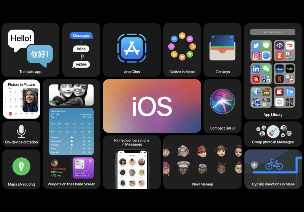
For the first time since iOS 7, I broke down and installed the first version of Apple’s iOS beta on my iPhone. While none of the new announcements for iOS 14 were groundbreaking, the new Widgets system and App Library called to me.
So I backed up my iPhone 11 Pro Max and ventured into installing the iOS 14 beta. After having lived with it for a couple of days, I’ve gotten some time with what’s new. Here are my first impressions of running the developer preview of iOS 14 beta.
Using Widgets
My desire to experience widgets on the home screen was the catalyst to install the iOS 14 beta on my phone. Usually, I wait for a couple of public betas to pass before diving into the beta world. But once I installed the iOS 14 beta, the first thing I did was mess around with the widgets.
Something about having this info on the home screen filled me with excitement. It must have been the excitement mixed with nothing else to do around the house for the past few months. Whatever it was, I decided to install this beta.

Widgets in practice 
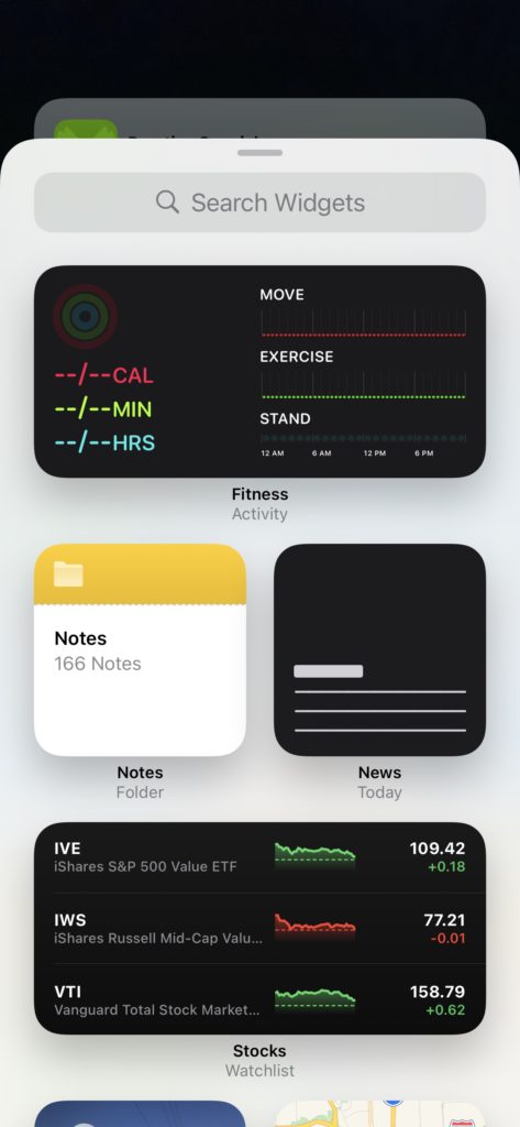
The Widget library
The widgets look really nice, and very much like what I wanted when I predicted widgets the week before WWDC.
Installing Widgets
Apple has made it very easy to install widgets on the iPhone.
- Simply long-press on the space between the dock at the bottom and the last row of apps, or if you hold down on an app until they start to jiggle.
- Once they jiggle, there will be a plus button in the top left of the screen. Press that button.
- Scroll through the suggestions offered or the list of apps below that to see what widget you want to add.
- Once you find the widget you want to add, you will be offered sizes. Select the size you want and click add widget at the bottom or simply press and hold until you can drag it. Then you can put it where you want it.
- Widgets can stack on top of each other. You can have up to 10 widgets in a stack.
Using Widgets
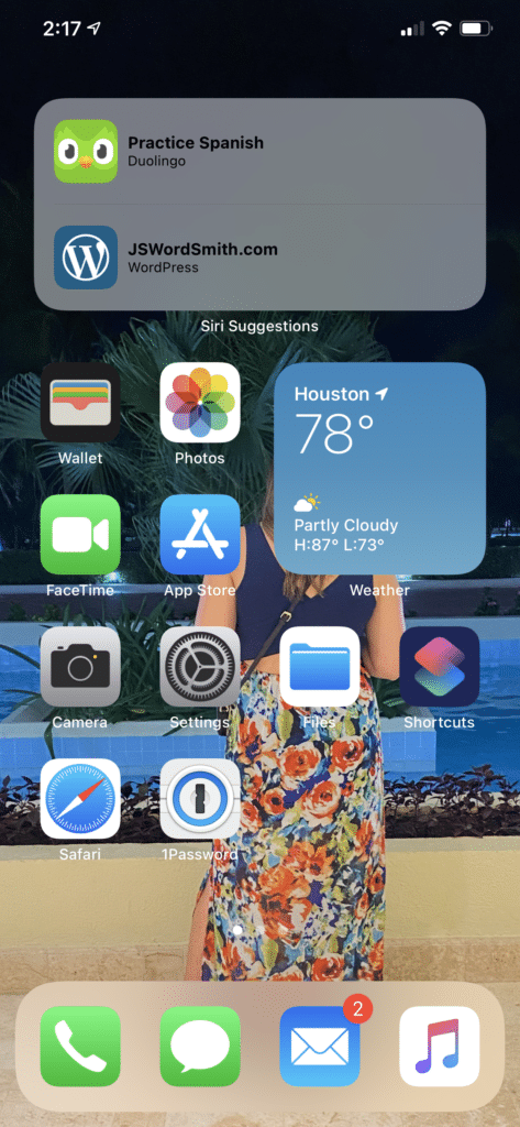
So far, I’ve completely reconfigured how I like my home screens because of widgets. I’ve put at least one widget on every app page and there aren’t even third-party widgets yet.
Installing the widgets felt pretty easy, but there were some complications getting them just how I wanted. I’ve found that moving and dragging them from the widget picker has been the easiest way to get them set up as you’d like them. It’s even fun to drag and drop them since Apple has programmed an animation that feels like a water drop when you place it.
The widgets provide information at a glance, which I love. So for example, I have a smaller weather widget in the middle of my first Home Screen. I can see what the temperature currently feels like, as well as get a sense of what type of weather resides over my current location. If I want more information than I can get from a glance at the widget, all I have to do is tap on the widget, and it will open the app with a smooth animation. Because of this, I’ve been able to hide many of the apps that I was using before.
Right now, since I’m on the iOS 14 beta and don’t have iOS 14 approved apps, I can’t get any widgets except the one’s Apple built. I can’t wait to see what developers come up with and if they can match Apple’s design sense here. I’m really looking forward to Fantastical and Overcast (so if you guys want me to help beta test, I’d be happy to) as well as many of the other apps I use.
The App Library

The other big change has been the App Library. The App Library rests to the right of your last home screen. A simple swipe as far right as you can go will bring you to this junk draw of Apps that Apple tries to keep organized for you.
I think once I use the App Library more I will get used to it. Before, I knew where 90% if all my app were located on my iPhone. Sure, I might have had to use search to find an app or two, but for the majority, I knew where they were.
But the App Library allows you to get rid of your apps from your home screens and still keep them on your device. It’s interesting. Since widgets take up so much space on your home screen, apps would need to be pushed around. If you have pages of apps, those pages just increased with every widget you used. So with the App Library, you have access to every app you need, and you don’t need to take up space.
Hiding Apps
So how to do you get rid of your apps and keep them in the App Library? There are two ways.
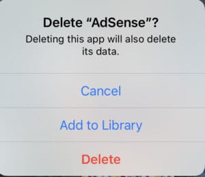
First, you can enter jiggle mode and hit the little X on an app as you used to when you wanted to delete an app. Instead of deleting an app now, users will be presented with a popup that asks if you want to delete the app or add to the library. You’ll need to do this one app or folder at a time.


Secondly, if you have an entire page of apps that you don’t mind hiding, enter jiggle mode and then press on the dots between the dock and apps on the Home screen. You’ll be greeted with a screen that gives an overview of all your home screens. By unchecking those boxes, your home screen pages will disappear from view.
The cool thing about the way this works, if you want to get those pages back, just go back to the page you unchecked them and recheck them. They will show back up unchanged.
This could be a great way to make a page of apps that you only use at work. When you get to work, make the page visible. When you leave work, uncheck it.
It’s very nice that Apple has made this method nondestructive, so that you can always get back to the comfort level.
Using the App Library on iOS 14 Beta
While I think the App Library will be great in time, it is taking me a little bit of time to get used to it. Before updating my iPhone to the iOS 14 beta, as I mentioned, I could find most of my apps fairly easily. I had folders that had apps categorized the way that I liked them. Apple’s approach categorizes apps differently than I do.
So of the folders that Apple puts the apps in don’t make sense to me. For example, I have a Home folder on my Home screen that controls all my Smart Home devices. In the App Library, some of the apps I use get put behind the Utilities folder while some go behind the Lifestyle folder. So if you go pecking around the Apple made folders, you’ll be looking for a while.
Also, while the design looks like your apps are in a larger folder, they aren’t. The top two apps, and the bottom left app icon will launch that app if you push on them. If you want to see everything in a category, you have to push on the smaller icon that holds multiple apps. It took me a few attempts to realize what was happening. I’m not sure that its a clear design choice.
Of course, inside the App Library, there is a search bar at the top of the screen. If you select that search bar, you can search for an app, but an alphabetically list of all the apps on your iPhone show up as well. You can scroll down to the app you need, and this will probably be easier than searching through the categories.
My verdict is still out on how the App Library will work for me on my iPhone. Sure I can hide some of the apps I don’t use often behind it, but will I use it to launch most of my apps on my iPhone? We shall see.
The Music App
Another area that I’ve really noticed a change has been in the Music App on my iPhone. In iOS 13, when you opened the app, it would default to the music in your library. Now in iOS 14, it defaults to the new Listen Now page. The Now Playing page has also seen a refresh.
Listen Now

The Listen Now page is the For You rebranded. It feels like Apple is trying to really up their game on recommendations. This page has larger icons that scream for your attention strewn about the page, as well as the familiar recommendations that have been around since the start of Apple Music.
This new page recommends artist radio stations more than ever before. I can only remember seeing a radio station on my For You page after I played a radio station. Now, it is the second column. Artists that you’ve recently played will be featured as a radio station to check out.
For the most part, the update to the Listen Now page is cosmetic with the addition of the radio stations added in. I think it’s a fresh change, and I’m interested to see if and how it evolves before the final release.
Now Playing


Another Music page getting a fresh coat of paint is the Now Playing screen. Now, instead of being the same color as the rest of the app, the Now Playing page laminates with colors from the album art. I think it looks nice and sleek.
Autoplay
Another cool feature that you can turn on in Music is the Autoplay feature. When you play an album or a playlist, there will now be a feature inside the Playing Next area of the app to allow Autoplay.

Next to the shuffle and repeat buttons, there’s a new infinity symbol. Play pushing on the button, Apple Music will now continue to play music once you get to the end of the album or playlist. I think when the playlist is over, it will start a radio station based on the last music you listened to. It’s a pretty neat feature for those that go through a lot of music in a day.
Compact UI
I can’t tell you how long I have waited for this moment! No longer will our iPhones be taken over when someone calls or when you invoke Siri. Thank you iOS 14 Beta!
Compact UI just feels so much better, even though I haven’t used it often yet. When someone calls or FaceTimes, instead of the entire screen showing the call, a simple notification will drop from the top of the iPhone screen. The notification has a green button to take the call or a red to ignore it. Of course, you can swipe the notification away to ignore the call as well, or swipe down on it to get the old full-screen page with options to message.
Similarly, Siri just shows up over the Dock to provide you answers. Answers show up as notifications. It is so much better than that full-page Siri before. I only wish that the requests also went into a page of the notification center so that you can access it when you needed it instead of it disappearing.
Bugs Running iOS 14 Beta
But everyone has to remember that this is Beta software.
I’m not trying to complain about the state of the software. I actually think it’s great, but there are issues. I wouldn’t recommend for anyone to upgrade at this point. In fact, I will probably be rolling back to iOS 13 in the next couple of days. The battery life hasn’t been optimized yet. My iPhone is struggling to make it through a full day on the iOS 14 beta.
Plus there are other issues.
Disappearing apps
Now, don’t freak out. Apps aren’t just disappearing out of no where. But I have had an issue where my apps disappeared a couple of times.
You know when you move your apps around your home screen and you have too many, the last one slides to the next page? Well, that worked for the first couple of minutes of messing around on the iOS 14 beta. When I tried to add a widget to a page that had too many icons, they went to the next page. Except that a couple of times they didn’t.
The just disappeared from all home screens. This happened every time I tried to add a widget to a stack on a full page.
Again, this is beta software and I’m expecting things like this to happen, but it happened a couple of times. It also made me forget what apps I had on that screen. But it has been an issue.
Moving Apps Around
When I tried to get those apps that disappeared back on my home screen, I’d head to the App Library. Since I knew what apps I was trying to get back, I would just search for it from the search menu. Once you find the app, it isn’t clear on how to get it back on to a home screen. I tried pushing and holding on the app to get the menu up, but it didn’t always show up.
It could be because my iPhone thought that I still had the app on a home screen. But I found that if I went to the app inside the app categories, I could push and hold on the icon to get an option to add to the home screen. You could also push, hold, and drag the icon to move it to the home screen you wanted, but that didn’t always work from the App List either.
Wrap Up
This has just been a quick overview of the my top aspects of the iOS 14 beta. There are more features coming and there are features that I haven’t really touched on. Do you have questions about something inside iOS 14? Leave me a comment below and I’ll try to answer!
But there are bugs in the iOS 14 beta. For most people, I would highly encourage waiting until iOS 14 comes out in the fall of this year. If you can’t wait that long, I would at least recommend waiting for the Public Beta from Apple. When Apple opens the program to this year’s updates you can sign up with Apple and get instructions on how to update and rollback to a working iOS if you need it.
But some of the features are exciting. I think this will be a good update when it rolls out to everyone in the fall. But for now, I would say stay away from the iOS 14 beta.
Discover more from JSwordSmith
Subscribe to get the latest posts sent to your email.


